
Brand Creation
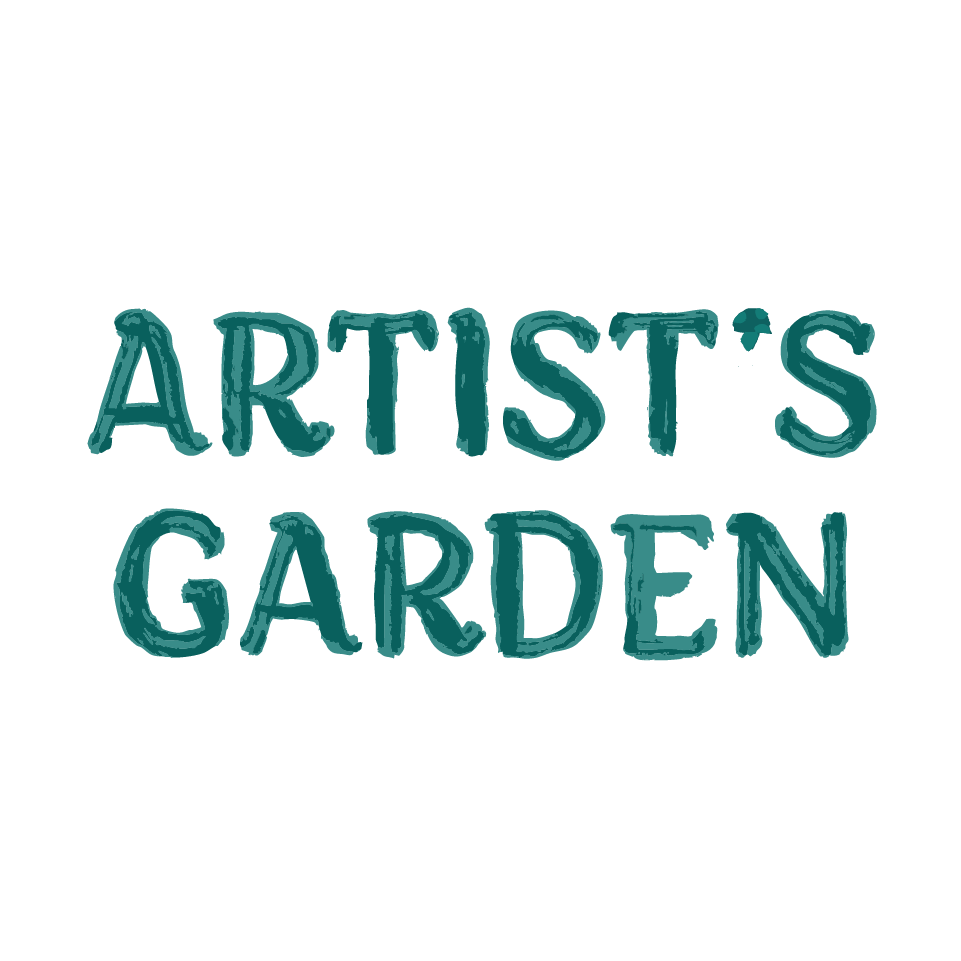
Artist’s Garden


About the Brand
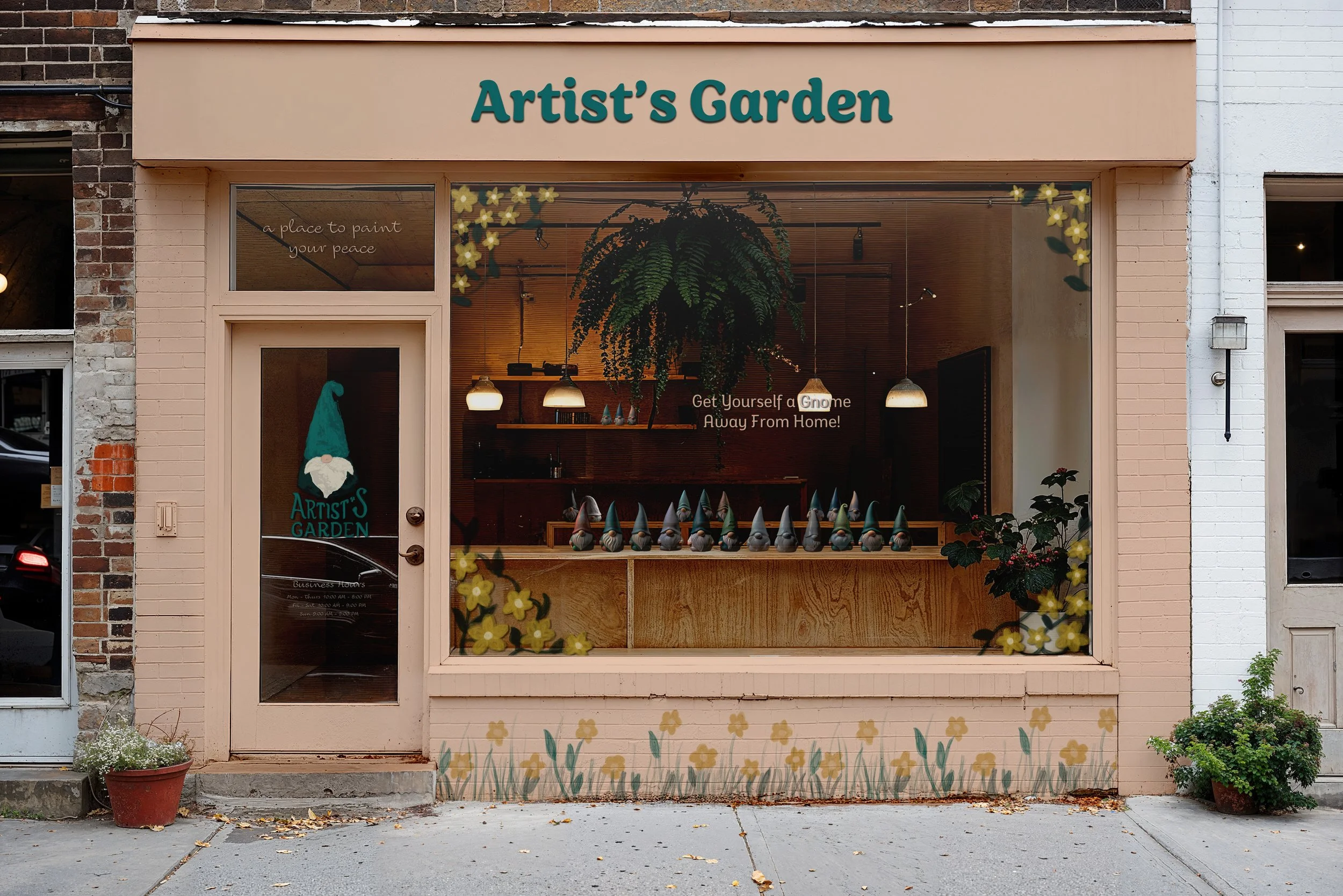
Artist’s Garden is an in-person pottery painting shop that specializes in guests garden gnomes and lawn decals. It is a place for people of all ages to partake in a simple, fun, and creative activity on any night out. It can be great for family outings, friendship retreats, and date nights. Guests can choose a blank gnome, colors scheme, and paint their own designs.
The make up of this brand is inspired by the company Color Me Mine and the process of allowing anyone to create their own art. The branding is displayed through colorful garden gnomes painting each other and playfully appearing in advertisements and merchandise. The elements of the brand are designed to be whimsical and fun, allowing clients to express themselves through the little creatures they create.
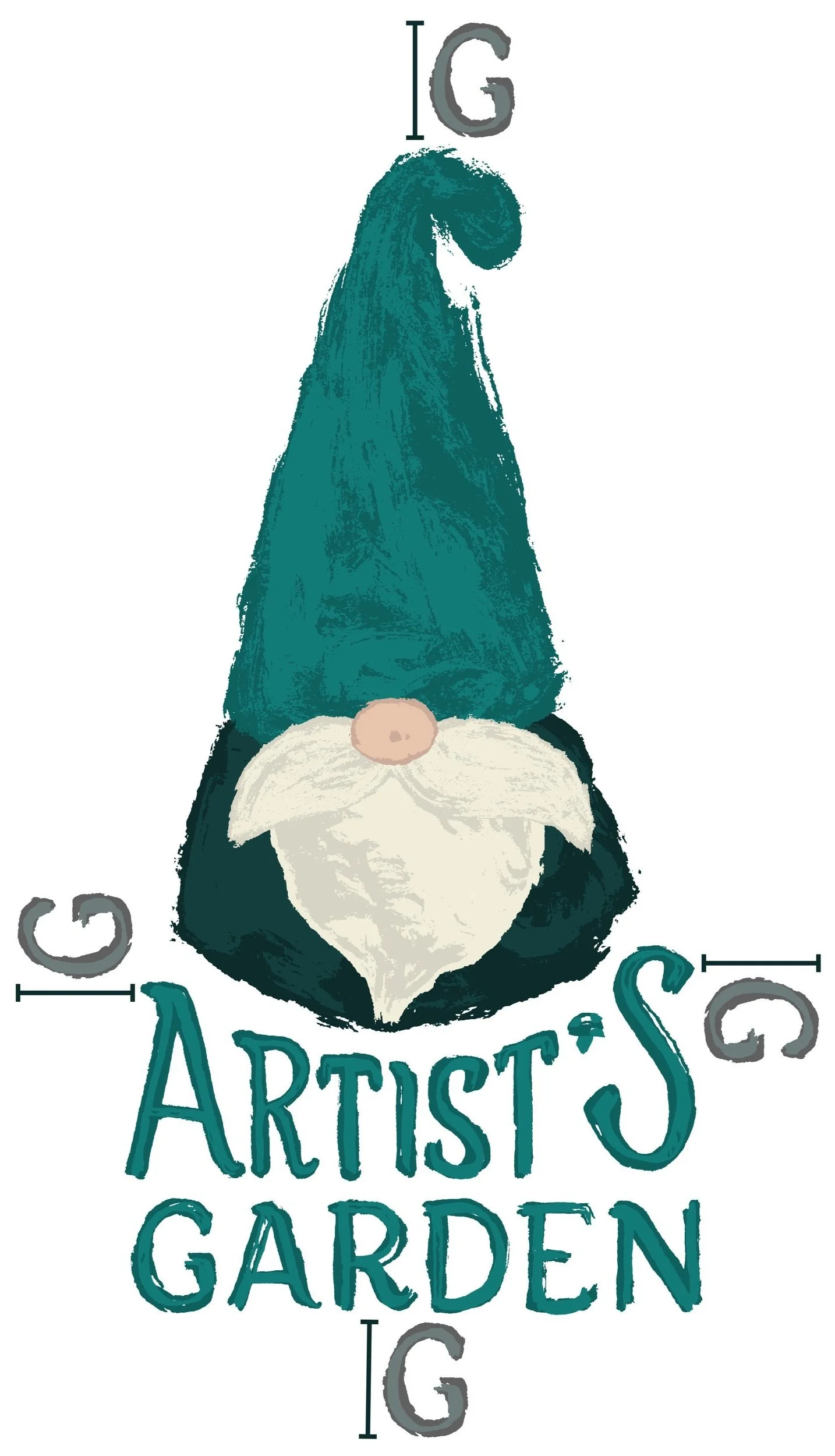
Full Logo
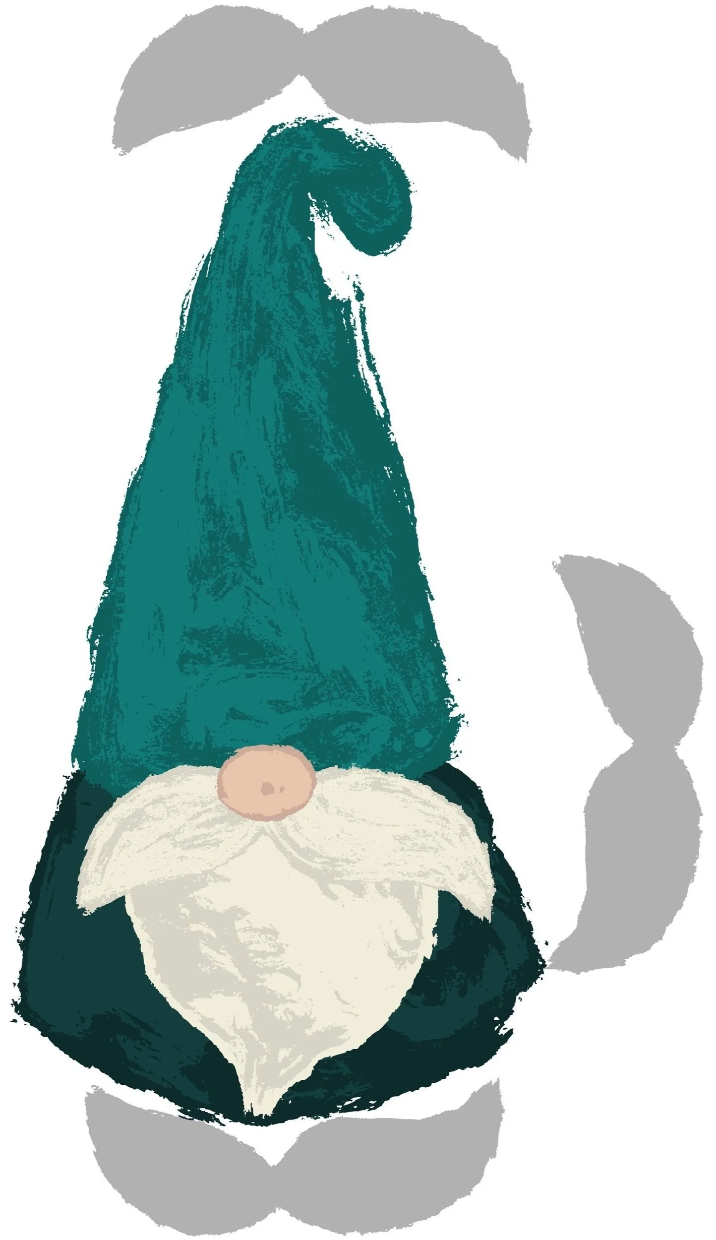
Logo Mark Only
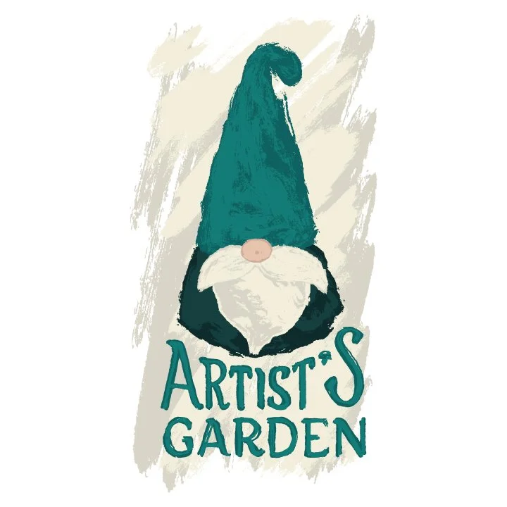
Background Variation

Black on White Logo

White on Black logo
Name Logo Variation
Colors
Dark Forest Green
0E2B2C
C:87 M:61 Y:64 K:66
A Gnome’s Hat
0E6160
C:89 M:44 Y:57 K:25
Mushroom White
F2EEDB
C:4 M:4 Y:14 K:0
Golden Flower
CDB25A
C:21 M:26 Y:78 K:0
Rosy Nose
E7C4AD
C:9 M:24 Y:30 K:0
Typography
Spacing
The version with text requires one “G” of space in each direction as pictured. The version with no text requires one mustache of space in each direction as pictured.
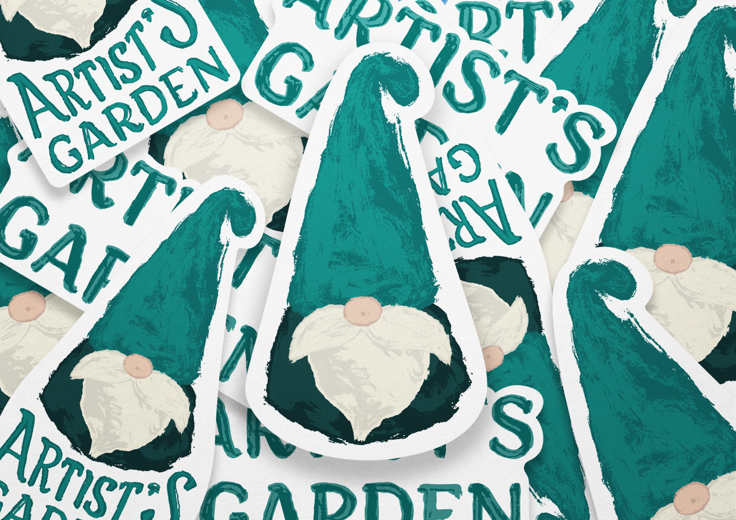
Sticker Set

Bus Stop Advertisement
Branded Tote Bag

Adobe Firefly: AI Generated Gnome Samples


Process
This project was inspired by a paint-able gnome that my college roommate gifted me for my birthday (and both of our moms who filled our dorm with gnomes). I saw it on my desk and began by designing a logo of a gnome taking on the shape of an uppercase and lowercase “g”. After realizing the shape of the gnome was more successful as an “A”, I experimented with different brushstrokes in Procreate, trying to find a way to make the logo more engaging. The watercolor texture helped to solidify the idea of a pottery painting business, and my logo really began to take shape.
Keeping the texture and charm of the raster illustration from Procreate was very important to me, and took some time to figure out when advancing the logo. I solved this problem by exporting each color layer into Adobe Photoshop and adjusting the values to be extremely high contrast. Once they felt right, I would use the image trace feature in Adobe Illustrator on each individual color piece and layer them back together. Many aspects of the branding remained true to the Procreate brush strokes, but the vectorized versions of these brushstrokes are what made up my final logo, including the type. A favorite detail of mine is the apostrophe disguised as a mushroom in the logo’s typography.

Credits
Art Direction: Jenny Kowalski
Mockup: “Canvas Bag Lying on the Tree Mockup” by Mr.Mockup
Mockup: “White Wood Storefront Mockup” by Mr.Mockup
Mockup: “Vector realistic illustration of white ripped paper on a transparent background.” by He2
Mockup: “Mockup of customized vertical sign on bus stop” by Moixó Studio
Mockup: “round artistic paint brush with red painted tip” by vvoe
Tools: Adobe Illustrator, Adobe InDesign, Procreate, Adobe Firefly (gnome product mockups)
Inspiration: Pinterest images of gardens and garden gnomes
Inspiration: Various Logo Lounge watercolor logos
Inspiration: physical garden gnome decorations
Inspiration: Color Me Mine