
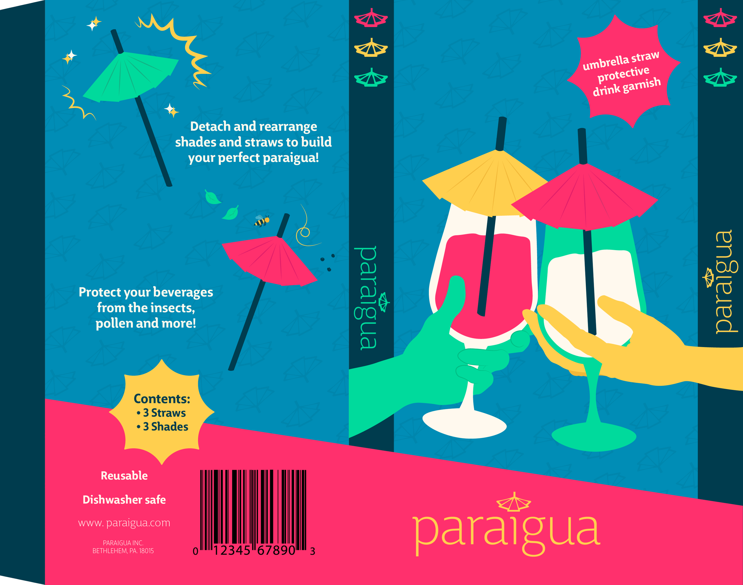
Packaging Design
Paraigua

About the Product
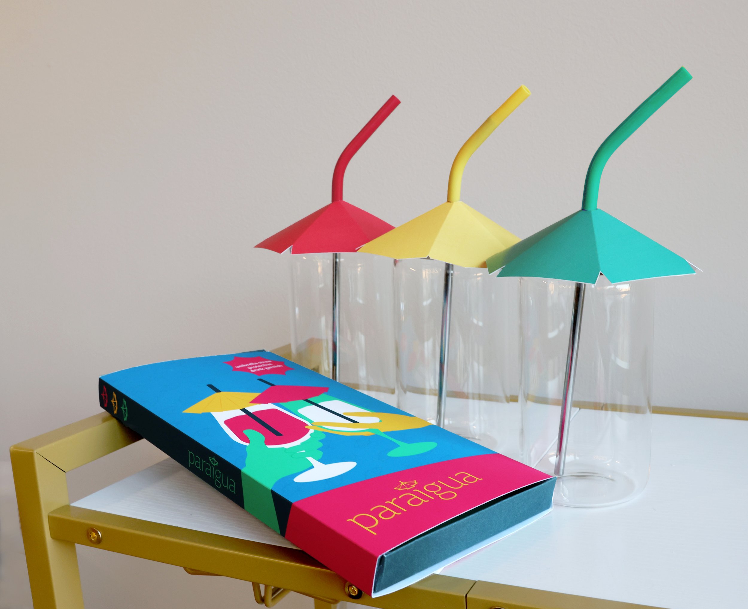
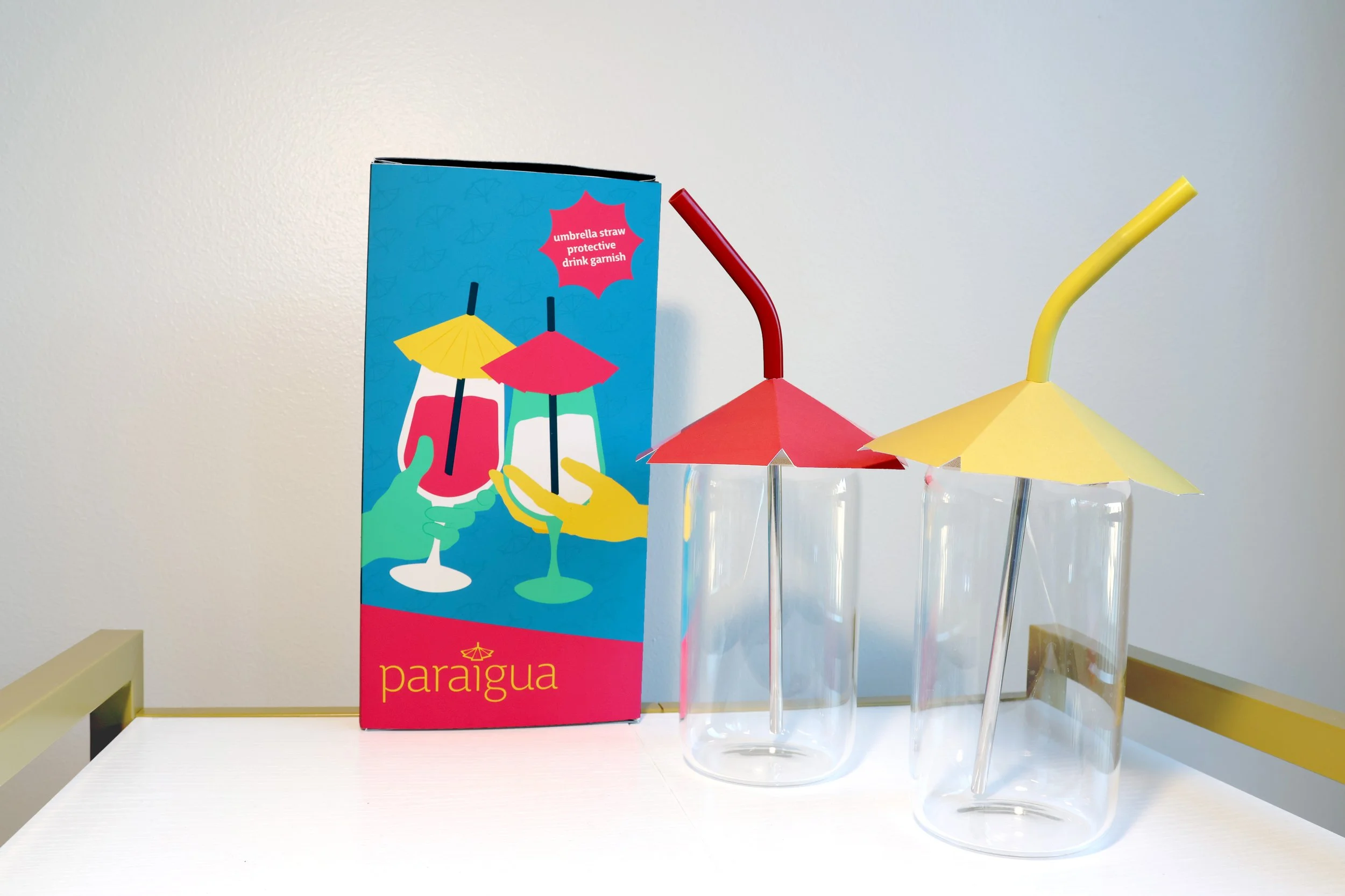
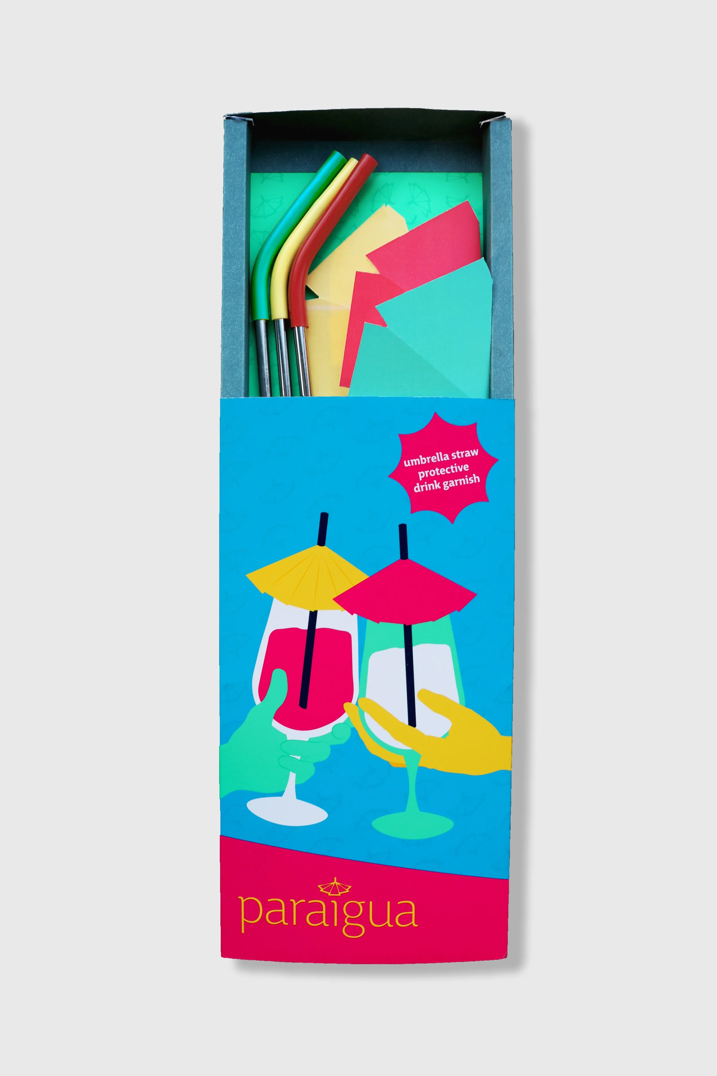
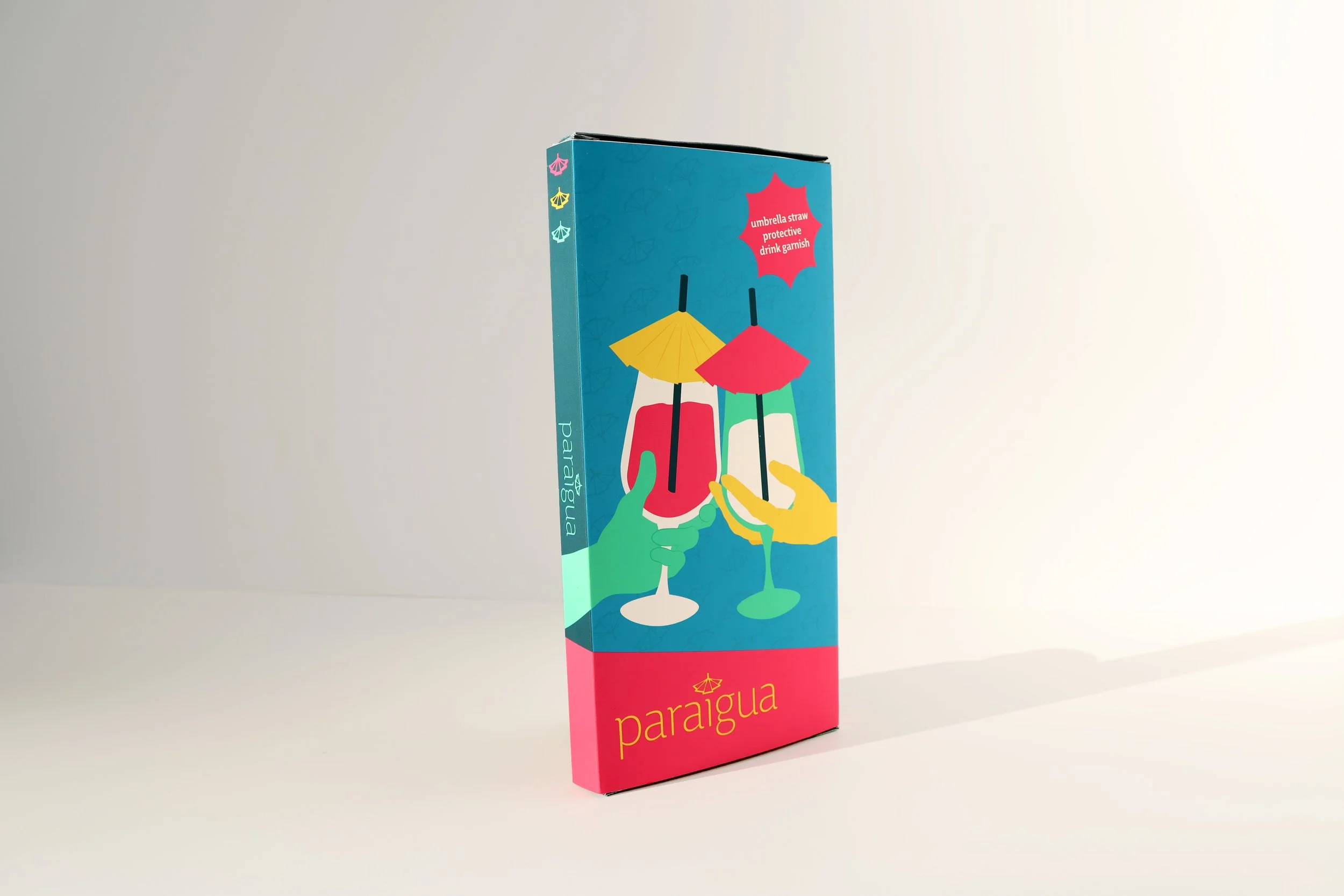
Paraigua is a product imagined to protect your drinks from the elements. It allows users to have a decorative garnish in their beverage, while also making sure that nothing additional can fall in. The packaging is bright and colorful to inspire fun and comfort throughout the brand.
The name “Paraigua” is the Catalan word for “umbrella”. It was chosen because of the way the letter forms interact Additionally, the prefix “para-” can be connected to the word “parasol”, meaning umbrella, and the ending letter forms “aigua” are reminiscent of the word “agua”, meaning water. Together, the word as a whole alludes to the nature of an umbrella covering liquids.
This brand was created for anyone to enjoy and protect their drink in whatever setting they most see fit.


Color Palette

Pink
#FF306D
C:0 M:99 Y:33 K:0
#008DB6
C:91 M:26 Y:17 K:0

Blue
#003C4E
C:100 M:66 Y:49 K:40

Dark Blue
#FFCF4E
C:0 M:20 Y:92 K:0

Yellow
#F2B838
C:0 M:32 Y:100 K:0

Dark Yellow
#00DA9C
C:80 M:0 Y:64 K:0

Green
#12B284
C:88 M:0 Y:69 K:0

Dark Green
#D9326C
C:0 M:99 Y:32 K:0

Dark Pink


Typography
Spacing

Process
My goal was to find a way to make disposable umbrella drink garnishes sustainable. The most straightforward way to do so would be to make them reusable. Additionally, by enlarging the umbrella and adding a straw, this product now has the function of protecting one’s drink.
When choosing the brand direction for Paraigua, I had to ensure that the marketing remained fun and decorative, while also portraying its safety features. Elements of the design, such as the traffic light color scheme on the side of the packaging, show the safety benefits in a light-hearted manner.
